17/11/2026
Getting a website on screen is an impressive party trick. Getting your website on screen, exactly the way you want it, and being able to change it next week, is the useful part.
You ask an AI to build a website. A few prompts later, there it is. Then you start looking around and discover that all these AI websites seem to look the same. The same layouts, the same visual tricks, the same feeling that you’ve seen this somewhere before.
Someone suggests finding a design skill for your agent. So you find one, try again, and see if you like the result. Another skill, another attempt. Repeat until you find something that works and feels like you. Eventually, the website is done.
Then a visitor tells you something isn’t showing properly in their browser. You look at the code. You look back at the chat. And you’re asking the AI again, hoping the fix won’t change something else.
Congratulations. You now depend on AI for your website.
This is why we build a visual website builder. Your text is text, your pictures are pictures, your layouts are yours to arrange. You can try something, see it, undo it, and keep going. You don’t need to become a developer to take responsibility for your own website, and you don’t need to persuade an AI to agree with the picture in your head.
A website builder should work for you, and that includes the browser work. Take the new corner-rounding shapes in Sitely 8. What’s straightforward in Chrome can need a workaround in Safari, including Mobile Safari. Browsers will improve, but older browsers remain in use, and there will always be another new feature to support.
We test these cases and build in the fixes for flickering, clipping and other browser quirks. That’s our job, and it’s part of what we deliver in Sitely.
Ask Codex or Claude to write the code for a box with those corner shapes, and you can’t assume it will also include the Safari-specific workaround. You may only discover the gap through extensive testing, or when a visitor tells you something is wrong.
Sitely’s MCP gives your AI agent a different way to help. It can use Sitely’s tools to take care of some of the boring work, creating native Sitely elements that already benefit from that browser compatibility work. You get the automation, and you can still open the result, see what changed and edit it yourself.
Today we’re super happy to introduce Sitely 8. There’s marketing hyperbole, and then there’s the reality of over 70 new features. This is the best version of Sitely we’ve ever made and the biggest upgrade we’ve ever released, built on the foundation we’ve laid over the years. It’s safe to say there’s something for everybody.
That means less time arranging the phone version, more ways to tell a story with photos and type, and control over how a website moves and responds. There’s also a bigger role for AI in doing the work, if that’s what you want, with you still in charge of the design. Those ideas run through the release: help you get further, then give you the tools to make it your own.
Sitely 8 introduces Sitely Ultra, a new tier for the most ambitious interactive websites. It brings together a new visual animation timeline, variable layouts driven by page states, immersive media, more advanced motion and an interface for AI agents. If you’ve ever thought “I wish I could make this do just one more thing”, this is where a lot of those things now live.
Here’s how the main ideas in Sitely 8 come together, from adapting your layout to shaping the whole visit.
On a wide page, you might set a headline beside a photograph and tuck a caption under one corner. Sitely’s freeform canvas lets you place each piece exactly where you want it. That composition can be just right on a desktop. On a phone, the same story might read better from top to bottom.
Assisted Layout takes care of that first mobile pass. Sitely arranges the content in reading order, fits images to the available width and keeps body text readable. The phone layout follows along as you edit the desktop page.
You get the best of both worlds: the freedom to place every pixel on desktop and a phone layout that Sitely builds for you. If you want the photograph to lead on mobile, drag it above the headline and pull the caption closer. Sitely remembers those choices the next time you edit the desktop page. To let Sitely arrange an element again, select it and choose Restore Automatic Layout.
If you’re bringing an existing website into Sitely, multi-device importing can bring in desktop and mobile layouts together, too.
The built-in preview includes device frames, saved named preview layouts and reduced-motion testing. With multiple-device preview, you can compare layouts together while refining the design.
A mobile home-screen installation prompt gives visitors a way to keep your website close at hand.
The comparison below shows the same sample page before and after Assisted Layout: first scaled down from desktop, then rearranged for a readable phone layout.
Before / scaled from desktop
After / Assisted Layout
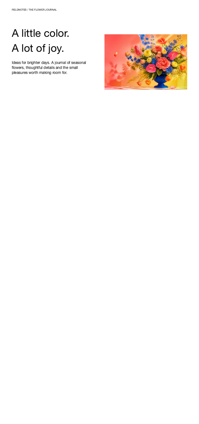
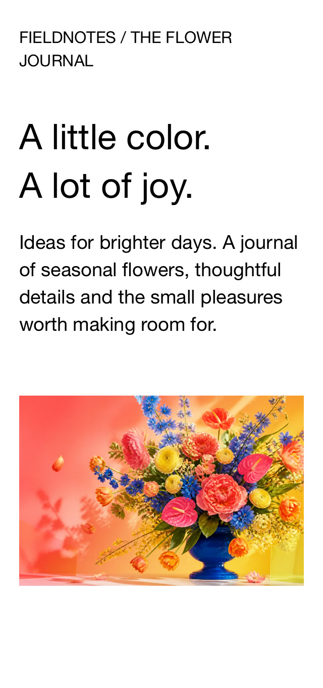
Assisted Layout (left) and Custom Layout (right), shown with the same desktop design.
Animation is often about the relationship between elements. A picture arrives, a heading follows, a little detail catches your eye just as you’re ready to move on. Getting that timing right is part of composing the page.
Sitely Ultra’s visual animation timeline makes those decisions something you can see and edit. Place keyframes, decide how an element should change over time, and refine the sequence until the parts work together. You can build a quiet introduction or something much more expressive, including 3D rotation, which is currently available only in the timeline.
In Sitely Ultra, multiple animations can live on the same element, so you can give it more than one part to play as someone explores the page.
The animation easing editor adds springs and custom curves, so motion can have the right weight and pace. The familiar easing presets are still there too. You can also add depth with 3D parallax and hover effects such as tilt and twist, or apply animations to all grid cells or their contents.
A state describes what a design should look like in a particular situation. A button can show a choice has been made; a group can reveal another view of its content; a page can move between arrangements as the visitor explores. Sitely Ultra’s group, button and page states, with state-control actions, let you build those changes visually.
In Sitely Ultra, button icons can morph as part of the interaction. And actions can run when video, audio, Lottie or Rive playback ends, so a finished clip or animation can hand over to the next part of the experience. You can think about how the visit unfolds, as well as how the page looks.
Also in Sitely Ultra, animated page-to-page transitions give a change of page its own continuity. Popup Magic Move connects an element on the page with its presentation in a popup, while gradient blur progressively softens the background. You choose the moments that deserve the attention.
A new slide animation lets layout blocks appear and disappear smoothly. Published sites respect visitors’ reduced-motion preferences.
Sitely Ultra includes 3D models and camera control, and sliders can drive 3D models and Lottie animations. For a product or an illustrated explanation, being able to explore can communicate something a flat picture can’t.
Previously licensed 3D model capabilities remain available to existing customers. New customers need Sitely Ultra for 3D models.
Try the timeline example below. Press Play animation for a six-second sequence: a jump and 3D spin, a sideways sweep, then a gentle settle. Press again to replay. The artwork uses native keyframes.
The timeline gives position, rotation, depth and scale their own tracks, so you can refine each change independently.
8

The visual timeline in Sitely Ultra. Separate tracks for each change.
A collection of photos has a rhythm of its own. Perhaps you want someone to stop at one image, look closer, then discover the next. Or perhaps the point is to see a whole body of work together. Those are different experiences, and Sitely 8 gives you more ways to compose them.
The new Cinematic Gallery starts as a stack of photos and opens into a fullscreen slideshow. It can turn a small space on the page into the beginning of a much bigger experience. Masonry and bento image grids offer other ways to arrange a collection, with a different balance between individual pictures and the whole.
You can crop images directly, including in classic and cinematic galleries and image grids, and add a reflection when it suits the presentation. Getting the picture itself right is part of the same process.
If you’ve already titled and described your photos in another application, IPTC metadata import brings that work into Sitely; smart fields can display photo titles and descriptions.
Gallery controls are much more flexible too: use your own arrow images, choose control placement, set thumbnail size and count independently, adjust thumbnail sizing per device, and choose image alignment. Other elements can drive the gallery’s next and previous slide, lightbox zoom and autoplay controls. Your navigation can look like it belongs on your website.
Opening a photo in a lightbox is a change of pace: the visitor has chosen something they want to spend more time with. The new lightbox layout editor lets you design that space too. Arrange the controls, use custom control images, add descriptions and play/stop controls, and choose the transition easing. The details around the photograph can feel as considered as the page that led to it.
Sitely Ultra adds panorama image and video support, opening up another way to explore a scene.
Try the sample gallery below. Open the photo stack to see a Cinematic Gallery in action.
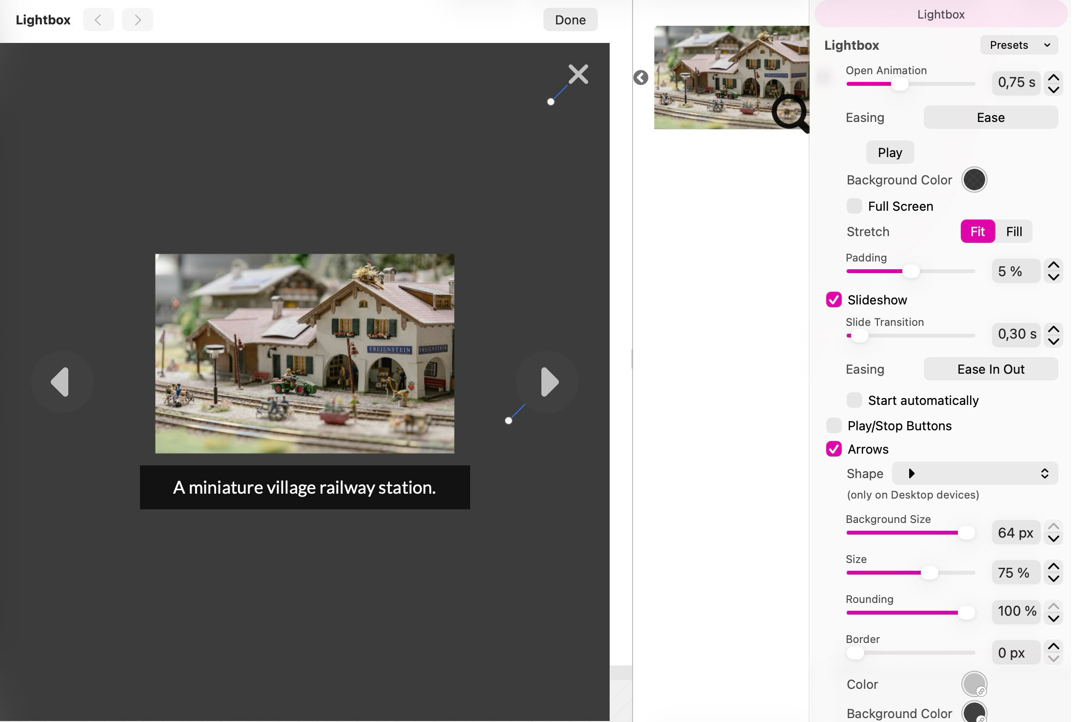
The Lightbox Editor: arrange controls and captions around the enlarged photo. Click the screenshot for a closer look.
Which brings us back to AI. There are plenty of website tasks where describing the work once makes a lot more sense than doing every small step yourself. Preparing a new page from an established design, updating repeated information, organizing a collection of images: these are the kinds of larger jobs you might want to hand to an assistant.
Sitely Ultra’s AI agent interface uses MCP, a standard that lets an AI agent work with an application’s tools. Connect an agent to Sitely and describe what you want to achieve. It can inspect the website and work with its pages, elements and settings, making changes inside the visual editing model.
The important moment is the handover back to you. You can open the result in Sitely, see what changed and refine it directly. The heading is still text, the gallery is still a gallery, and the phone layout is still there to review. You can continue the conversation with your agent, or simply grab the thing you want to change.
That’s how the two approaches fit together for us: an agent helps with the work, and the visual builder gives you a direct way to judge and finish it.
For work that calls for custom integration, Developer Tools is now also part of Sitely Ultra.
This article is one example: an AI agent used Sitely’s tools to arrange the sections, add the gallery and build the keyframe animation. The result is a native Sitely page, ready for you to select and edit.
1. Describe the job
“Arrange this launch post around five themes.”
2. Let the agent work
Pages, text, images and native animations.
3. Make it yours
Select any element and refine it in Sitely.
Claude · Fable 5.2
ChatGPT Codex · Astra 6
ChatGPT Codex, using the Astra 6 model, and Claude, using the Fable 5.2 model, driving Sitely via MCP with an identical prompt.
A page rarely begins life as a perfectly measured rectangle of text. You add a paragraph, find a better photo, decide the opening needs a little more room. Until now, arranging a story across several separate text boxes also meant keeping track of which words belonged in each one.
Linked Text Boxes let the text continue from one frame into the next. You keep editing one story while composing the page around it. Think of a travel journal with a wide opening, a photograph in the middle and the rest of the story beside it. Change the words or the space, and the text can flow through the linked frames.
Then there’s the lettering itself. A price list benefits from tabular numerals that line up; a recipe feels more considered with proper fractions; a long article can use old-style numerals that sit comfortably with the surrounding letters. Ligatures and contextual alternates use the character shapes built into a font.
Advanced typography brings those controls into Sitely, along with slashed zero, drop caps and outlines. From the first letter of an editorial page to a large outlined headline, you can give the words character while keeping them real text.
Web fonts are stored in the project file, so they travel with your work and make it simpler to keep editing on the iPad.
New blog index layouts, featured images and excerpt controls help you introduce each post. The blog widget brings posts onto other pages, so a story can find a place elsewhere on the website too.
The linked frames below share one story. The specimen shows ligatures, fractions and tabular numerals. The drop cap above is real text too, and stays that way when published.
The best journeys leave room for a detour. A narrow road, a shop window full of flowers, a café you hadn’t planned to visit. These are the details that turn a route on a map into a story you want to tell.
A page can leave that room too. Start
The best journeys leave room for a detour. A narrow road, a shop window full of flowers, a café you hadn’t planned to visit. These are the details that turn a route on a map into a story you want to tell.
A page can leave that room too. Start
The best journeys leave room for a detour. A narrow road, a shop window full of flowers, a café you hadn’t planned to visit. These are the details that turn a route on a map into a story you want to tell.
A page can leave that room too. Start with a few words, give a photograph space, and let
The best journeys leave room for a detour. A narrow road, a shop window full of flowers, a café you hadn’t planned to visit. These are the details that turn a route on a map into a story you want to tell.
A page can leave that room too. Start with a few words, give a photograph space, and let the story continue beside
The best journeys leave room for a detour. A narrow road, a shop window full of flowers, a café you hadn’t planned to visit. These are the details that turn a route on a map into a story you want to tell.
A page can leave that room too. Start with a few words, give a photograph space, and let the story continue beside
Lorem ipsum dolor sit amet, consectetur adipiscing elit. Aliquam tincidunt lorem enim, eget fringilla turpis congue vitae. Phasellus aliquam nisi ut lorem vestibulum eleifend. Nulla ut arcu non nisi congue venenatis vitae ut ante. Nam iaculis sem nec
One story, two linked text frames. The arrow shows the link.
Small details. Big difference.
office affinity flowers
1/2 1/4 3/4
111.00
888.00
The improvements start with 10 new website templates and canvas controls for rotation, corners and gradients. Option-hover highlights what’s inside a group, and Option-click selects it directly. You can choose custom canvas layout-grid colors, find recent colors in the picker and recognize synchronized colors by their badges. Designer Notes on pages and elements give you somewhere to leave the reasoning behind a design. Future you will appreciate that.
Style presets help you reuse the appearance of elements, including form controls, and images can now fill your page backgrounds. Checkboxes and radio buttons can have their own appearance; dropdowns gain custom images and styled options menus. The small details get to belong to your design as much as the big ones.
Borders, corner radius and shadows can vary by device. New shadow styles, including animated and hover shadows, add depth; corner rounding gains different shapes and individual corners. Image and background filters work on SVGs, and buttons can include icons.
You can also build viewport-height layout blocks with adjustable height and content alignment, add shape dividers between blocks, and use auto-hiding sticky headers with effect, duration and scroll-sensitivity controls.
Set a website-wide default social-sharing image and override it on individual pages. Site search gains quoted phrases, exact-match terms and exclusions. The modern audio/video player includes themes, playback-speed controls, skip buttons, time-display options and video picture-in-picture. Instagram widgets work on pages and inside blog posts.
OpenStreetMap maps support multiple markers and configurable controls. Website-wide interactive light/dark theme switching gives visitors System and Toggle actions.
Publishing only changed pages saves time, with publication statistics to show what happened. You can localize search, privacy and login pages and the cookie banner, and add Paddle Billing payment buttons.
JSON-LD structured metadata generation covers your website, pages, images and videos, with BlogPosting, Product, ProfilePage, Service, SoftwareApplication, Event, Course, ImageObject and VideoObject types. It’s a way to describe what your content actually is to the services that read it. Sitely Ultra also supports multiple visitor analytics services.
Here’s a breakdown of all 70+ new features by tier.
To get started, update Sitely to version 8. On the Mac, choose “Check for updates” from the Sitely menu. If you purchased through the App Store, update it there. If you’re downloading a fresh copy, use the same store you originally purchased from so your license is preserved.
Sitely keeps the app update separate from the license upgrade. A subscription includes new features in your chosen tier; with a one-time license, you can decide whether to purchase a feature upgrade. If you purchased Sitely 6 or 7 after June 1, 2026, your upgrade to Sitely 8 Personal or Sitely 8 Pro is free. Other one-time upgrades from Sitely 6 or 7 are 50% off.
Prices for Sitely Personal and Sitely Pro are unchanged: $79.99/€89.99 for Sitely Personal and $119.99/€139.99 for Sitely Pro as one-time purchases. The Sitely Pro subscription remains $59.99/€69.99 per year.
The new Sitely Ultra is $199.99/€229.99 as a one-time purchase, or $99.99/€119.99 per year as an annual subscription. Ultra includes Developer Tools, previously sold separately for US$99.99, £99.99, or €119.99.
For those who prefer never to think about upgrades again, Sitely Pro Lifetime is $359.99/£349.99/€419.99 and Sitely Ultra Lifetime is $599.99/£599.99/€699.99. Both include all future upgrades with a single purchase.
Our Black Friday promotions are now underway. See the Black Friday offers for savings on new licenses, subscriptions and upgrades.
This is a lot of new territory for one release. But the idea behind it is the same one we started with: give people the tools to make a website that looks and feels like their own.
Start with the everyday improvements, try a different way to show your photos, or build that interaction you’ve had in mind for a while. You can see what you’re making, and you can keep making it better.
Always on. Keeps the site working.
Enables optional features.
Remembers your settings.
Counts visits and page views.
Tailors ads to your browsing.
We and our partners use optional cookies for extra features, saved preferences, visit counts and personalised ads. To change your choices later, use Cookie settings in the footer.
Closing keeps optional cookies off. Privacy policy
