Introduction
Using Sitely
Elements
How to
A Video Tutorial is available for this topic Click Here to view
Sitely’s unified color panel brings color consistency to your website design. Whenever you select a color option in the style panel, you will be presented with the color panel.
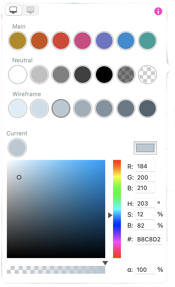
Within the panel there are three groups of colors, the first row of colors is your main palette, these are the colors you establish for your website. The second row contains the neutral colors that will typically include black and white. The last row contains the default wireframe colors that Sitely applies to elements when they are first added to your web page. In normal use, the only colors you may wish to change are those contained in the top, main row, For clarity, we will refer to this first row as your website palette.
Below the rows of colors are tools that enable you to create colors. These include a hue/saturation and brightness slider, and spaces to enter numeric values for RGB, HSL, Hex, and opacity.
Sitely offers a standard main color palette to get you started. However, when setting up a new site, you would typically change the main colors to reflect the colors you want in your website. To do this, select one of the main colors you want to replace, its outline will highlight to show it’s selected. Then, use the various tools to change the color to one of your choice. Repeat this for the other colors you wish to change. If you know the color values of the colors you wish to use, simply enter them into the relevant boxes. For example if you wanted to create a color palette such as this one:
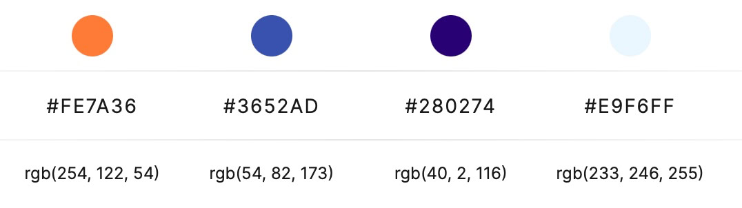
you could simply enter the Hex code, or the rgb code in the relevant boxes in the color panel.
The important thing to note is that selecting a color in the panel and then making changes will overwrite the selected color in the color panel and all page elements using that color.
Another way to edit colors is to use Apple’s built-in color picker. You can access this by clicking on the color picker box in the color panel. It looks like this:
The eye-dropper tool enables you to select any color from your computer screen.

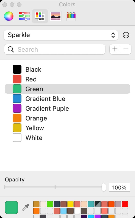

When this is selected, Apple’s color picker will open.
In the example shown here, we have a Sitely color swatch that was created for use in other Mac applications, and saved as a custom swatch. With the color picker open, just select the color you want to add to your main palette. Your chosen color will replace the currently selected main color in Sitely’s main color palette. You can, of course, use any of the color picker tools offered to generate new colors, including the eye-dropper tool:
By setting up your main color palette and using it consistently to apply color to your page elements, you’ll be ready-to-go when you decide to give your website a color make-over. Just open a copy of your existing site project file, and change the color in your main color palette. All the page elements using the old colors will change throughout your site to reflect your new color scheme.
By selecting this option and changing the color, your change will only affect the currently selected element. Your selected color will not be added to your main website palette.
You may have a situation where you need to apply a color to a page element that isn’t part of your main website palette. When that occurs, you can select the element on the page and then use the ‘Current’ color option in the color panel:

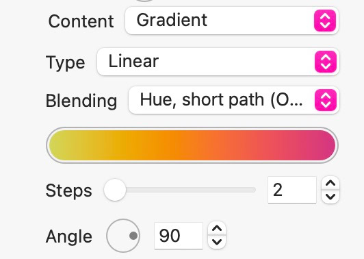
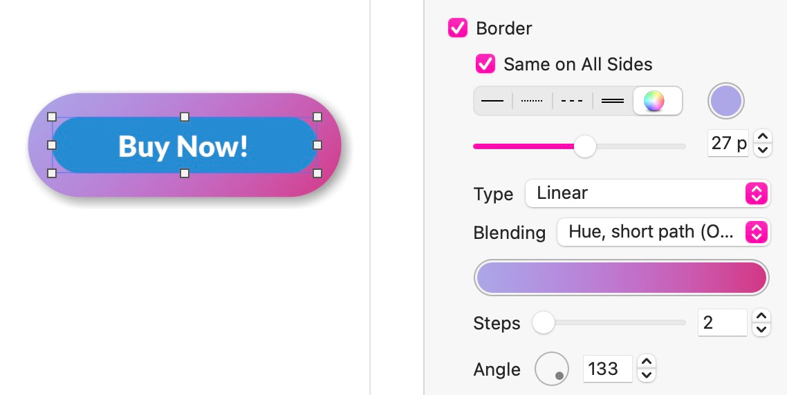
The color picker lets you pick the two ends of a gradient, or in the case of a multi-step gradient, each color step. Additionally the gradient can be set to be linear (in the direction of the angle), radial (from the center to the edges), or conic (a circular sweep starting from the angle).
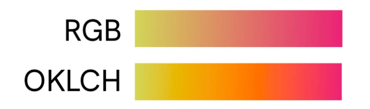
The gradient is a continuous color variation (ramp) between the color steps, the next setting lets you pick whether the ramp should be in red, green and blue colors, or in a color space that’s more similar to human vision, attempting to preserve hue and luminosity (the OKLCH color space). For many color combinations the latter produces more pleasing and lively gradients.
Gradients can also be applied to box and button borders:

Clicking sends your details to Google, which sets cookies and uses your data to personalize ads
Show video
Please report any shortcoming in this documentation and we’ll fix it as soon as possible!
Updated for Sitely 6

