Introduction
Using Sitely
Elements
How to
Sitely focuses a lot on what could be thought of as the first level of web design: static visual design. The visitor experience depends on the more classic design elements like color, contrast, font and geometric space. Here we will look into Sitely’s animation feature.
The use of the word experience is very specific, because attempting to integrate animations can be both enjoyable and frustrating (hopefully bit more of the former, and less of the latter). The reason is animations can disturb the design balance a lot more than static elements. Given the illusion of life and motion, you can end up with too much, or too little, disconnected parts that don’t fit and even hurt their surroundings.
But when done right, these limited life entities make the design feel more like an organic interaction. The storytelling flows and the contents of the page become warm invitations to further exploration.
So lets play.
This is a simple design about Halloween with the intent to capture some of the fun and craziness.
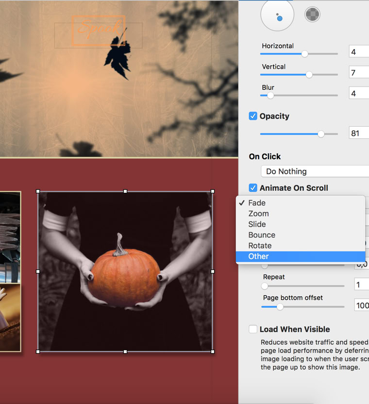
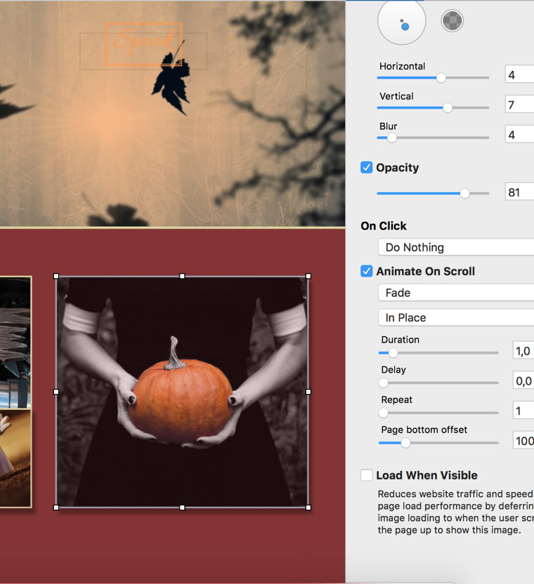
Scroll animations can be applied to images, buttons, text boxes and video elements. You enable animations via a check box in the style tab. This will expose two drop down menus, one to select the animation and the other to choose the direction and type of movement. The last choice on the first menu, other, exposes a list of unconventional animations, which could work with Halloween. Below animation style choice are timing, repetition and distance controls.
Despite this being less restrictive than, say, a corporate design, we still need to be careful about the animations we choose. Our moving elements: a slab, a ghost dog, a bike decoration, three little ghosts and a pumpkin that looks like its being held by Wednesday Addams.
After some experimentation we end up with these choices:
As for a more regular example of the animations, in this design the delay function is used to create a linear discovery and exploration theme, while also communicating the services of the advertised company:


Please report any shortcoming in this documentation and we’ll fix it as soon as possible!
Updated for Sitely 6