Introduction
Using Sitely
Elements
How to
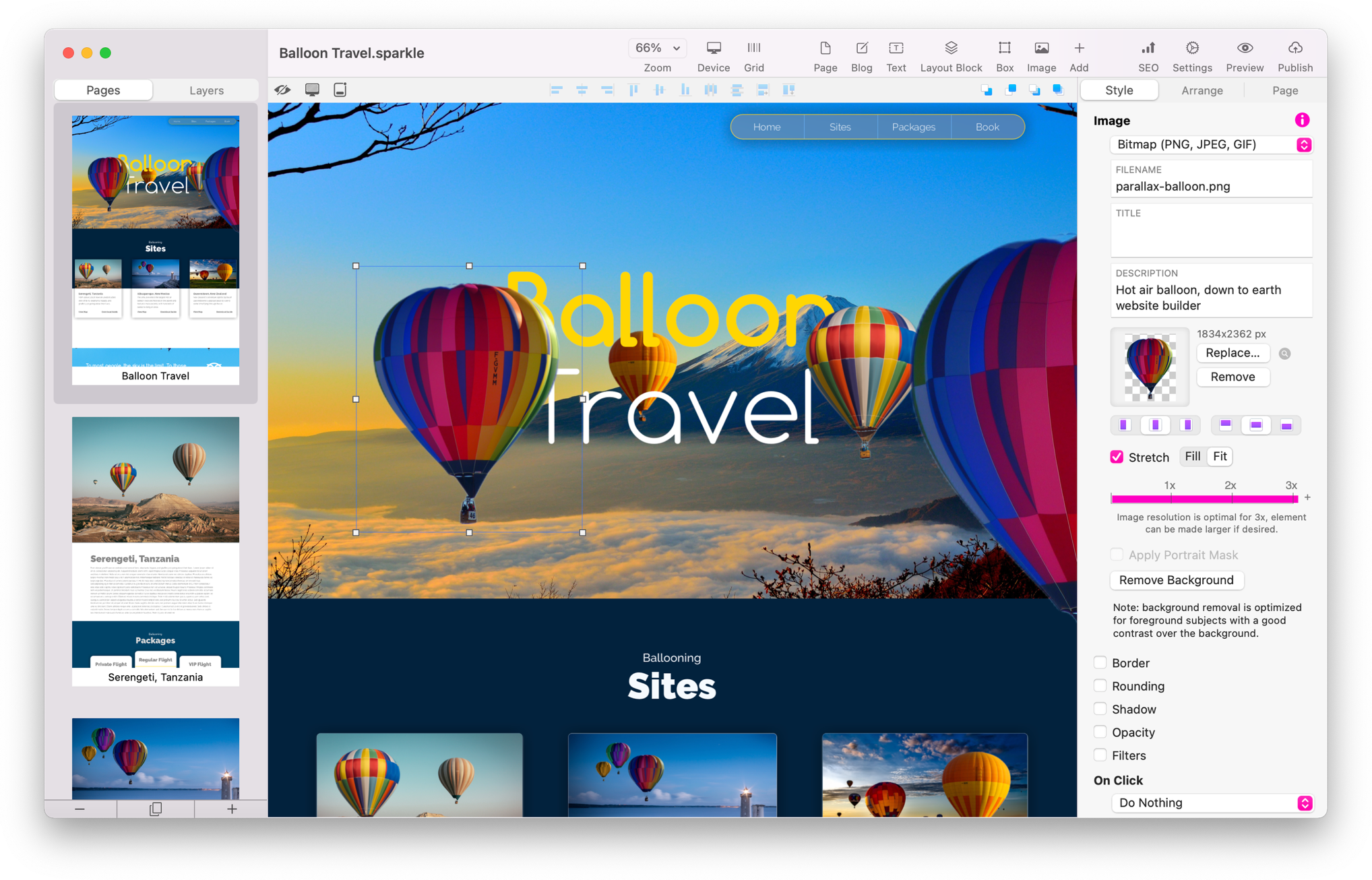
Explore the Sitely interface effortlessly by clicking on the numbered hot-spots in the image below. This will reveal the purpose of each interface element. Don't worry about the details now; the user guide will cover how to use each tool in depth. Take a moment to get acquainted with the layout.
The main canvas, where you'll design your web pages, occupies the largest part of the interface. Conveniently, all the necessary tools are situated around the edges and remain accessible at all times. You won't need to search for optional tool panels or rearrange windows – everything appears when you need it.


Finally the page bottom element, within the canvas, lets you make the page shorter or taller. While the page is generally clipped where content ends, the page bottom is useful in conjunction with elements that follow the page footer (see the Arrange inspector page). A double click on the page bottom will move it up to bump against the last element on the page.

Sitely adheres to the modern macOS document model, so documents are autosaved in the background and versioned by the system. You can open multiple files in multiple windows, or as tabs of the same window.
Sharing Sitely website files is safe and secure, publish settings and user accounts are stored in an encrypted form in your project file.
Please report any shortcoming in this documentation and we’ll fix it as soon as possible!
Updated for Sitely 6
1
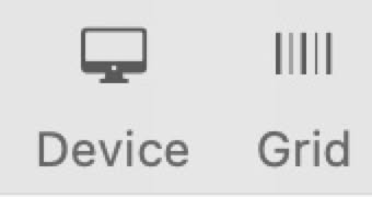
Canvas control: zoom level, current device and device switching, canvas grid.

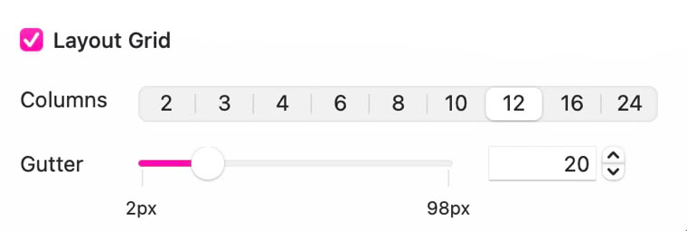
The Device setting allows you to switch between devices and to add new devices. The grid settings give the option of setting up different grids for each device.

10
The selected page is displayed on the canvas in Sitely, a WYSIWYG application. You can interactively work on elements by selecting, moving, and resizing them. The canvas zoom ranges from 25% to 400%, with the default behavior fitting the document width for easy resizing. While scrolling is simple, zooming in may cause overshooting. To navigate precisely, hold the spacebar, grab the canvas, and move it. Sitely displays overlay boxes, lines, and guides by default for alignment, toggled with the tab key to declutter the view.
2
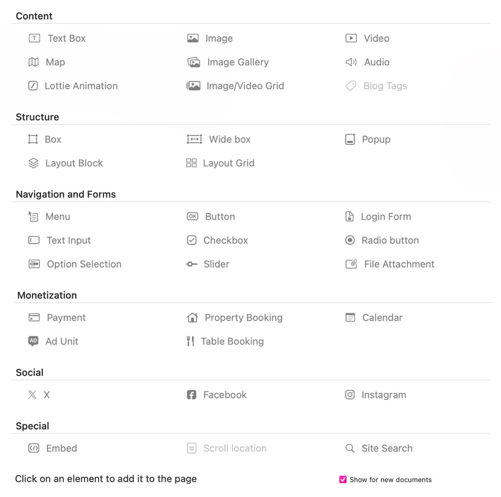
Add a new element to the canvas.


Clicking the + Add Icon will popup a full toolbox of all available elements.
3
Opens the site settings, preview control and publishing control.
Since the Sitely toolbar is fully customizable, like most macOS applications, these are just the defaults. You can right click or control click to customize the contents.

4
The Pages/Layers tabs allows you to switch between page thumbnails and the layer list.
Toggle thumbnails in the View menu, adjust the sidebar for larger thumbnails or more title text. The layers panel showcases elements, groups, popups, and Layout Blocks. Selection in the list highlights the corresponding element in the canvas, and vice versa.
The Pages/Layers bar has an icon to combine pages and layers in two columns. Edit layer names directly or via the arrange inspector. Layer naming is for documentation, not affecting code generation. Popup layer names are more useful in the interface than for other elements.
Layers provide access to elements beneath and control stacking during scrolling. Stick to top groups may overlap. Greyed-out layers are hidden on the current device.

Sitely’s format bar offers quick access commands that are commonly used or useful to have near the canvas and canvas elements.
5
These are the view options
These are the stack options


These are the element alignment options

6
The inspector tabs let you pick which group of settings to display. The Style and Arrange panes always refer to the currently selected element. The Style pane contains most of the element-specific settings such as its visual aspect and behavior, whereas the Arrange pane contains mainly position and size settings. The Page pane contains settings for the current page.

The page outline will show all of the pages in your document, with the option of organizing pages in groups. From here you can rename and reorder pages and page groups.
The outline thumbnails are a simplified representation of the page contents. For example they don’t show the content of very long pages, the different page alignments, menu drop downs or animations, but they’re useful for context.
7
8
The inspector immediately reflects settings for the currently selected item. Conversely, changing a setting immediately reflects the change in the canvas and in any open preview. There are three inspectors presented as tabs. The Style tab, where changes to individual elements on the page are set, the Arrange tab where the placement of individual elements can be controlled, and the Page tab where you can control settings for the whole page.
In the context of the page outline, these buttons let you add, duplicate and delete pages and page groups.
9

Duplicate Page
Delete or Add Pages