Start here
Editing and styles
Media and content
Tutorials
Site and publishing
Layout and navigation
Forms and services
Let visitors turn independent options on or off and style the two checkbox appearances.
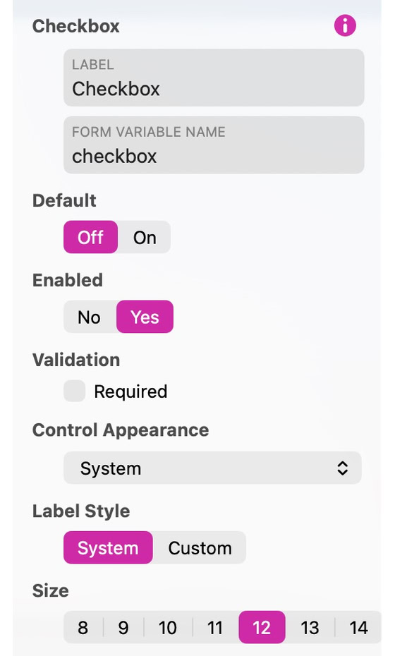
Use a checkbox for a choice a visitor can switch on or off. Several checkboxes can be selected together. Set the initial value, whether the control is enabled, and whether checking it is required.
In Control Appearance, choose System, Custom or Images. Custom supplies Off and On fill and border colors, a symbol color, size and label gap. Images lets you provide separate Off Image and On Image artwork. Preview both values and the focus feedback.
Use Save Preset in the Style inspector to reuse this appearance on another control of the same type.
See Forms for configuring submission and delivery.
Please report any shortcoming in this documentation and we’ll fix it as soon as possible!
Updated for Sitely 8

Powerful and refreshingly simple, at home on Mac, finding new freedom on iPad.
This website makes use of cookies.
Please see our privacy policy for details.