Erste Schritte
Medien und Inhalte
Tutorials
Website und Veröffentlichung
Layout und Navigation
Formulare und Dienste
Anleitungen
A lightbox displays an enlarged image over the current page. Use the Lightbox Editor to design its background, controls and captions. Images, Image Galleries, Image/Video Grids and Videos set to Still + Embed in Lightbox use this editor.
For a single image, select it and choose Zoom Image in Lightbox as its On Click action, then click Edit Lightbox. For an Image Gallery or Image/Video Grid, select the collection, enable Lightbox in the Style inspector and click Edit Lightbox.
The editor shows the opened lightbox beside the page. Changes belong to the selected image or collection. Click Done to return to the page. Click any screenshot in this guide for a larger view.
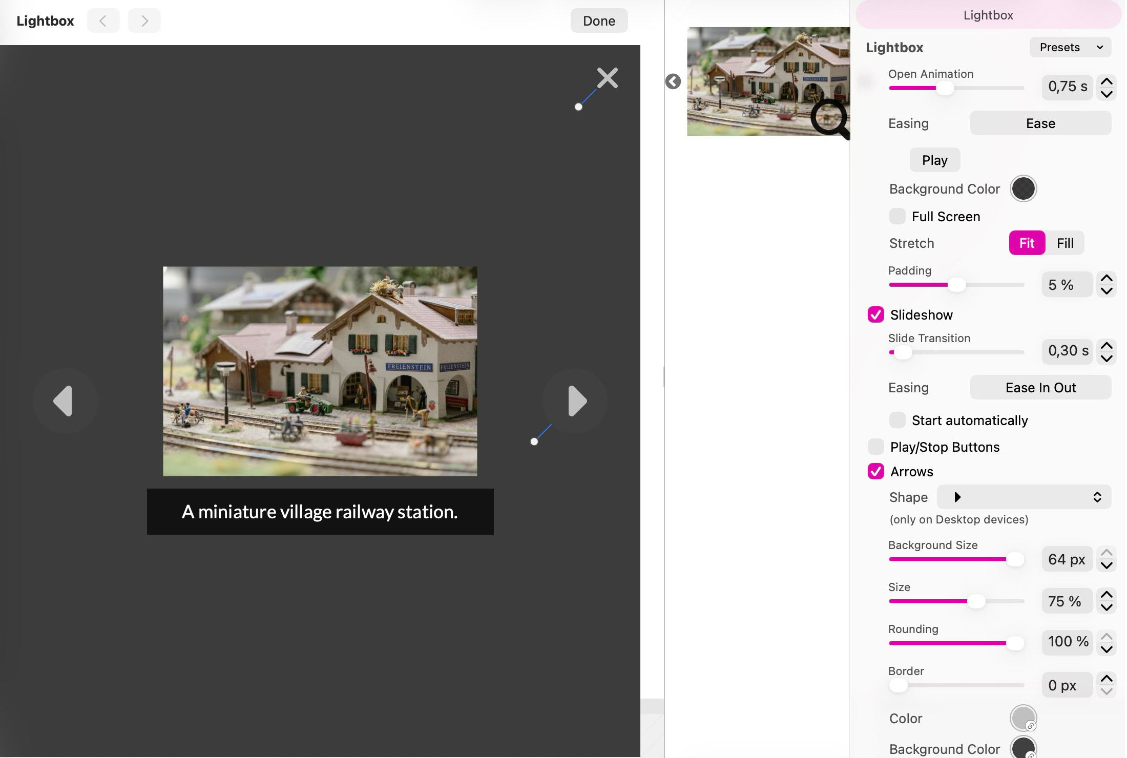
The Lightbox Editor previews the enlarged image and controls while you adjust their appearance.
Open Animation sets the time taken to open the lightbox. Easing controls how that movement accelerates and slows down; use Play to preview it.
Choose a Background Color and its opacity to control how much of the page remains visible. Full Screen requests fullscreen viewing when the lightbox opens.
Stretch offers Fit, which keeps the whole image visible, or Fill, which fills the viewing area and may crop the edges. Padding leaves space around the content. Check both portrait and landscape photos before choosing Fill.
For an Image Gallery or Image/Video Grid, enable Slideshow to let visitors browse the collection in the lightbox. Set Slide Transition and its Easing independently of the opening animation. Start automatically begins playback when the lightbox opens; Play/Stop Buttons give visitors playback controls. Play/Stop Buttons have a Size, Corner Rounding, Background Color, Color, Mouse Hover Color and Mouse Clicked Color, and an X and Y position.
Enable Arrows to show previous and next controls on desktop. Choose their Shape, Background Size, Size, Rounding, Border and colors for normal, hover and clicked states. On phones, visitors swipe between images.
Keep Close Button enabled so visitors can leave the viewer. Choose its Shape and Size, including custom artwork when needed. Drag the control handles in the editor or use their X and Y position fields to place the arrows and close button. The close button also has its own colors.
Enable Image Description to show the image’s description as a caption. In a collection, each image keeps its own description. Choose a Text Style and use Edit to adjust the typography; Background and Rounding style the caption area, and Padding keeps it away from the screen edges.
Placement offers Custom, Below Image and Bottom of Screen. Custom gives the caption a draggable position in the viewer. Below Image keeps the caption with the photo and adds a Distance setting for the gap. Bottom of Screen anchors it near the bottom edge.
Width can follow the Image Width or use Full Width. Below Image fits the photo and caption together, and long descriptions can scroll. Preview long captions at phone width so they leave enough room for the image.
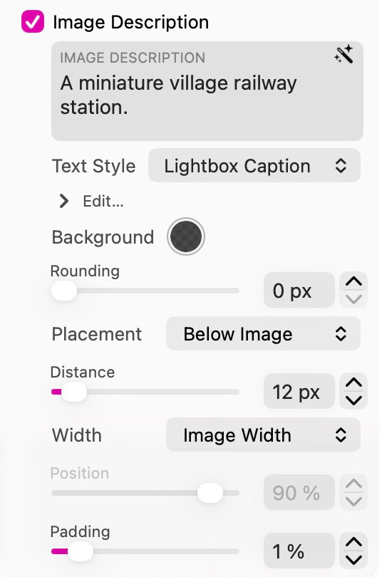
Below Image keeps the caption with the photo. Distance sets the gap; Image Width follows the photo’s width.
Open Presets beside the Lightbox heading and choose Save Preset to name the current design. Select that preset on another image, gallery, grid or video lightbox in this project to reuse it.
A preset saves the current layout’s lightbox appearance and behavior, including control artwork and positions, caption typography and placement. It keeps the destination’s media and description text.
After editing a saved preset, Apply updates its saved settings; Revert restores its saved settings to the lightbox you are editing. Other lightboxes keep their current appearance until you select the updated preset on them again.
Default restores the built-in settings. Rename Preset changes a saved preset’s name, and Delete Preset removes it from the project without changing lightboxes that already used it.
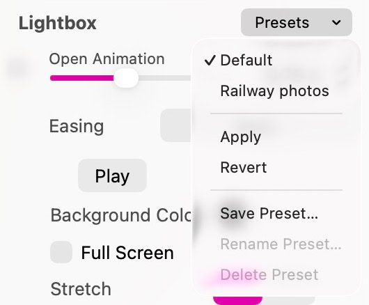
Presets are stored in the project. This example includes a saved preset named Railway photos.
Click Done, open Preview and activate the image or gallery. Browse the collection, test the close button and Escape, and check narrow and wide windows. Image protection is inherited from the source image or collection, including its lightbox versions.
Related: Images · Image Galleries · Image/Video Grid · How to zoom an image in a lightbox
Bitte Bericht alle Mängel in dieser Dokumentation und wir werden es so schnell wie möglich beheben!
Aktualisiert für Sitely 8

Leistungsstark und erfrischend einfach, zu Hause auf dem Mac, neue Freiheit auf dem iPad zu finden.
Always on. Keeps the site working.
Enables optional features.
Remembers your settings.
Counts visits and page views.
Tailors ads to your browsing.
We and our partners use optional cookies for extra features, saved preferences, visit counts and personalised ads. To change your choices later, use Cookie settings in the footer.
Closing keeps optional cookies off. Privacy policy